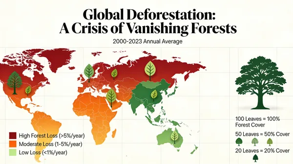
Global Deforestation Data Visualization Map
Prompt
A beautiful and informative data visualization for a report on global deforestation. The main visual could be a world map where countries are colored based on their rate of forest loss, or a series of stylized tree graphics where the number of leaves represents the remaining forest cover. The design should be impactful and emotionally resonant, not just a dry chart, demonstrating the ability to turn data into a compelling visual story. –ar 16:9
61 Personen haben diesen Prompt verwendet
- Modell
- Seedream 4.5
- Größe
- 600 × 337
 Seedream 4.5
Prompt & Bild von Jared Liu
Gesammelt über Awesome Seedream 4.5 Prompts (CC BY 4.0)
Alle Rechte am Bild liegen beim ursprünglichen Urheber. Kontaktiere uns, um die Entfernung zu beantragen.
Global Deforestation Data Visualization Map
A compelling and impactful data visualization representing global deforestation rates. The design features an artistic world map with color-coded regions illustrating forest loss, combined with stylized tree graphics that symbolize dwindling canopy cover. This informative graphic blends scientific data with an emotionally resonant aesthetic, serving as a powerful visual narrative to raise awareness about environmental conservation and the urgent need to protect our planet's vital ecosystems.
Ähnliche Bilder
Zurück zur Galerie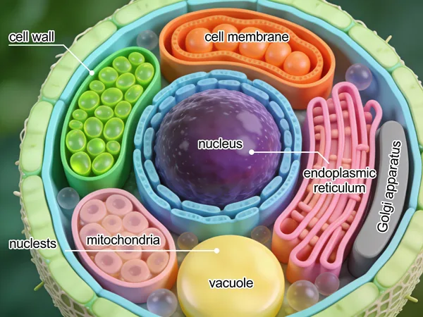
Detailed 3D Scientific Illustration of a Plant Cell
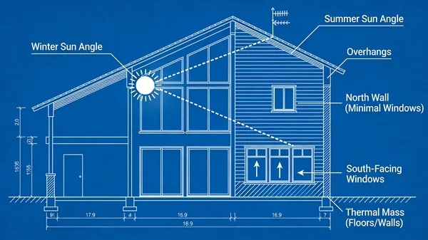
Passive Solar Design Architectural Blueprint

Isometric Illustrated National Park Map

How FDM 3D Printing Works Diagram

Ergonomic Desk Posture Safety Infographic

Rustic Homemade Pasta Recipe Card Illustration
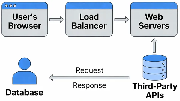
Modern Web Application System Architecture Diagram

High Energy Try Not To Laugh Challenge Thumbnail
Etwas Tolles erstellt?
Teile deine Bilder in der Galerie. Geteilte Bilder werden dauerhaft gespeichert, und du erhältst Credits, sobald sie veröffentlicht sind.